Does Your Packaging Tantalise The Tastebuds?
There are many well known food brands that we recognise purely on the strength of their logo and packaging; Coca-Cola, for example, or Kit-Kat – both are distinctive, bright and use set fonts to boldly promote the name of the product. Knowing the brand and being attracted by the packaging make half the battle in persuading a consumer to pick your product off the shelf, so it’s key to consider this when looking to design new packaging.
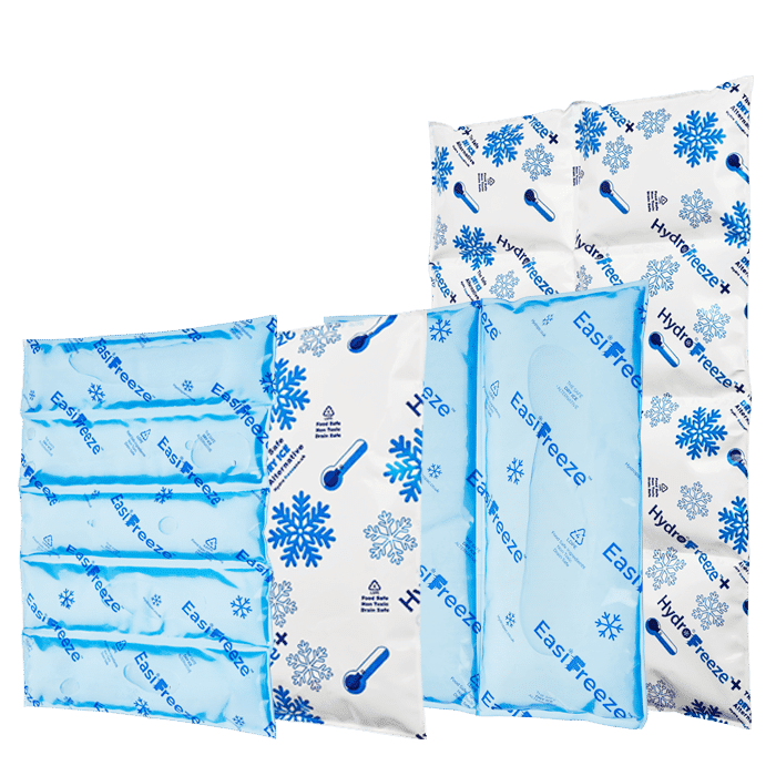
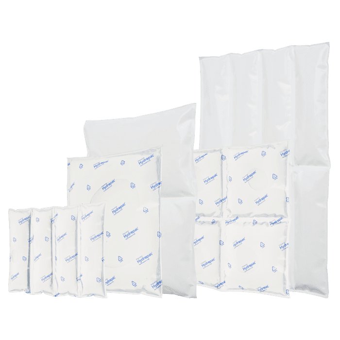
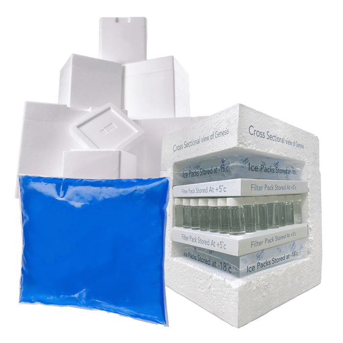
Custom chilled solutions for you
Hydropac offers every customer a customized solution for chilled and conditioned shipping. For example, we help a customer with limited freezing capacity to deliver gel packs frozen and ready to use, and we can manufacture almost all shapes and sizes of cooling elements. As a customer, you come first: we are here to help you.
Shape
This is largely dependent on the product (you wouldn’t package a rectangle inside a circle, after all), but that doesn’t mean you can’t put your customer’s needs first when you’re choosing a shape. Making sure that packaging is versatile and ergonomic means that your customer is more likely to pick it above something that isn’t, so consider aspects such as handles, texture and the physical shape during the design process.
If your item is heavy, or liquid, how will it be picked up easily? Does it need to lie flat/stand upright? If it’s designed to be eaten “on-the-go”, how can the shape of the packaging best make this easy for the customer, with minimal hassle and mess? Can the packaging contain the food as it’s being eaten, to store away for later if unfinished? All of these things are key to creating food packaging that will tantalise the customer’s tastebuds before they get to the checkout!
One other aspect to consider is a clear window – these are great for showcasing the food inside, for both food and drink.
Colour
Colour plays a very important part in how we choose products, especially food. Different colours signify different things to the brain, especially when hungry, so for food packaging, colour is key!
- Red – stimulates the appetite and also makes the brain pay attention to any writing – now you know why many fast-food chains make good use of the colour red (think KFC, for example). Red also signifies love and passion, so for restaurants, red is a good choice to entice people through the door.
- Yellow – makes you feel warm and cheerful, more likely to say “yes” to a purchase because the product makes you feel happy to look at it. Yellow also increases metabolism.
- Orange – another warm colour, this promotes excitement and enthusiasm. You’ll want to strongly consider this as a colour choice, as this type of packaging calls out to customers. Brands such as Jacob’s use oranges and yellows against their black & white logo to make a statement.
- Green – Green = health, eco-friendly and, in some cases, upmarket food produce. If what you’re selling ticks any of those boxes, then consider green as a primary colour. Foods such as veggie meals and salads often come in primarily green/see through packaging, so the green is clearly visible. M&S use a lot of green in their packaging, as do Waitrose.
- Black – A statement colour, black is often used mainly for logos and to stand out against other colour choices such as white, red and orange. However, black can also signify high end, luxurious produce and slimming food choices, so this would be a good colour option but may need to be used sparingly depending on what other colours you’re using. You’ll see a lot of black on brands such as Slimming World and Loyd Grossman foods.
- Brown – a reliable and slightly boring colour, brown still has its place in the world of packaging, and not just for cardboard boxes. Also used to signify eco-friendly products, brown is commonly used for foods such as nuts, breads and crackers to promote the “basics” aspect of this type of food – think Hovis or Graze.
- Blue – blue is a very corporate, professional, productive colour so it is often overlooked for food, but it is used by bigger brands such as Kelloggs and Heinz. Given Kelloggs promote their cereal as giving you a boost to start the day, this is no surprise! If your products give a similar message then blue is an option, but if you’re selling something such as meat or meals for dinners, blue is probably not the best choice.
- Purple – the colour of royalty and success, purple is often found on packaging that purports to be “fit for kings” or higher end. That said, purple is quite a fun colour and has been used as such by brands such as Cadburys and Metcalfe’s. Purple is a very strong colour so if you’re going down this route, be bold with it!
- Grey – innocence and purity are often the key traits associated with grey and so you’ll see it on health foods or waters, although to be honest it’s one of those colours that the eye overlooks, so it’s not used often as a primary colour for foodstuffs. It is used, though, by brands such as Twinings, but you’re more likely to see it on cosmetic items than food.
- Pink – a fun, vibrant and bold colour, pink is great for promoting an eye catching logo or message. You don’t want to overdo it on the pinks though unless that’s the colour your brand revolves around, because it does tend to appeal to women more than men, so you may be limiting your target market. You’ll see pinks used on packaging by brands such as Metcalfe’s again or Hartley’s.
- White – another statement colour, white looks good when contrasted against other colours such as black or red. White on its own is often used for takeaway containers or plain cereals. Brands to make good use of white packaging include Asda’s Value range and McDonalds.

Reuse & Recycling
The subject of reusing and recycling our packaging has become huge, especially for plastic packaging, so this is something to consider – not only for the environmenwAReliA atal impact but also to appeal to your customers. Are you more likely to make sales if your packaging is eco-friendly/not plastic? Is that even feasible for your product range?
If your packaging can be reused by the customer, think about how to promote this. You could include a slip inside with possible reuse ideas or write them on the outside. An example of this is the classic McDonalds Happy Meal, which not only forms a handy carry case for the food inside but can then also be used as a plate. Because it is made of cardboard, it is then easily recyclable using the household recycling bin. Longer term, packaging such as our Reflective Air Bags can be used as insulation for rabbit hutches, hot food or even carpet underlay. If your packaging has similar benefits, promote them!
If your packaging can’t be reused but can be recycled, again, promote this. Use the triangular recycling symbol as well as recycling instructions so consumers know what they can and can’t recycle from it. Don’t not promote the recyclability of your packaging, especially if it is plastic, as this won’t win you any points with customers.
Sustainability Hydropac and CSR
Sustainability isn’t just a trend for us – it’s a promise. As we innovate, create, and lead, we keep our planet’s well-being at the forefront. With Hydropac, you’re not just preserving the quality of your cargo; you’re contributing to a healthier world.
Experience the power of sustainable temperature assurance with Hydropac – where excellence and environmental responsibility coexist for a brighter future.